The financial markets can get pretty messy. Tech can make the S&P 500 Index the star performer while the Utilities sector can quietly take the lead when investors and traders start to position themselves more defensively. That’s what you see when it comes to sector rotation in real time.
I’ve been using US sector rotation techniques for the past 15 years. They help me figure out where market leadership is building and where the cracks are, that is relative market weakness.
When you deeply analyze it, sector rotation reflects the reallocation of capital across the market as participants expect shifts around economic growth, inflation, rates, earnings, credit and risk appetite. When those forces change, leadership changes too.
The sector moves can be attributed to the economics and fundamentals. We monitor sector rotation because it signals where the economy may be headed, allowing traders and investors to anticipate turning points or rotations before the data releases really reflect them.
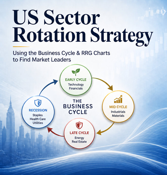
Sector rotation is very closely linked to the business cycle. As the economy expands, matures, slows, contracts, and eventually recovers, capital tends to move towards the sectors best positioned for each phase.
4 phases of the business cycle: Early Cycle, Mid Cycle, Late Cycle, and Recession
There are 4 phases of the business cycle:
Theoretically clean but messier in real life. But it’s still useful.
In the early cycle, the economy starts recovering from a slowdown or recession. Policy is usually accommodative, credit conditions improve, earnings expectations start to increase, and investors begin to re-risk. Here you see Consumer Discretionary, Financials, Industrials, Technology, and in some cases Real Estate begin to lead, even before the economic headlines improve.
For the mid cycle, growth becomes steadier, earnings strength broadens, confidence improves, and markets start pricing durability rather than emergency recovery.
When the economy is in the late cycle, its momentum slows and headwinds increase. Inflation can rise, margins can compress and you see where central banks tighten monetary policy, and the yield curve may flatten or even invert as credit conditions become less supportive. In this phase you see traders and investors rotate toward sectors with stronger pricing power, commodity exposure, or more stable earnings. These sectors include Energy, Materials, Health Care, and Consumer Staples.
Finally, there’s recession. Growth contracts, profits decline, credit stress rises, and investors usually become more defensive.
Risk appetite disappears quickly.
In that scenario, investors usually prefer the Consumer Staples, Health Care and Utilities sectors. They’re definitely not exciting. But in a proper bear market, not exciting isn’t a weakness.
There are 2 types of sectors: Cyclical and defensive.
Cyclical sectors tend to perform better when economic growth is improving because their revenues and earnings are more sensitive to consumer spending, business investment, lending activity, industrial production, and market confidence. The cyclical sectors are:
On the other hand there are defensive sectors. The classification includes:
These sectors tend to hold up better because people still buy groceries, medicine, and electricity during recessions, even when broader markets are under pressure.
They’re not always producing positive returns in these cases. They’re not T-bills.
The Energy sector is a bit more complex. Sometimes its performance can be due to a growth trade. Other times it can be inflationary pressures or supply shocks. So when Energy starts leading, we need to figure out why before treating it as straightforward as cyclical or defensive.
Table of Sector Rotation across the Business Cylce
Sector rotation is not a true form trading system but it is useful. The business cycle rarely is clean or textbook. The cycle can skip phases, get distorted by fiscal policy. The business-cycle acts as my macro map but it is not the final answer.
For me price, relative strength, momentum and volatility determine the final conclusion.
And that’s where my main tool comes in.
I use the RRG for sector & ETF selection and portfolio allocation.
An RRG plots sectors, securities, or asset classes against a common benchmark. Bounded or unbounded. For US sectors that would mean looking at them against the S&P 500 Index or another broad market index.
The indicator just doesn’t tell me whether a sector is rising or falling. It shows whether it is gaining or losing relative strength to the overall benchmark. That’s really important for me.
A sector can move higher in absolute terms and still underperform the S&P 500.
I want to know who’s leading, who’s fading, who’s quietly improving, and who’s dead in the water. That’s why the RRG helps me see.
Relative Rotation Graph comparing US sector ETFs against the S&P 500 benchmark over a three-month daily period
Source: StockCharts.com
The RRG is separated into 4 quadrants by 2 axes.
JdK RS-Ratio is on the x-axis.
JdK RS-Momentum is on the y-axis.
Both are normalized around the 100 level.
The RS-Ratio is for relative strength, When it is over 100, it indicates relative outperformance to the benchmark. Conversely, when it is below 100, it signals relative underperformance.
The RS-Momentum shows whether that trend is strengthening or weakening, which is often the more useful early signal because momentum can turn before leadership full rotates.
The 4 quadrants of the RRG are as follows:
Infographic of the RRG
A move from Improving to Leading can evidence emerging Leadership while a move from Leading to Weakening can signal leadership fatigue. Sectors in the Lagging quadrant would need exceptional circumstances for me to overweight them.
Indeed, when a sector transitions from Lagging to Improving, I become more attentive and bullish towards it.
I have the RRG as my own weather man. It tells me where there are storms and hurricanes and it tells me when there are clear, blue skies.
Since 2018 I have created my own RRG-based allocation framework. It’s straightforward. Clear, but not simplistic. The model reviews sectors across multiple RRG timeframes, scores each one, and converts those scores into portfolio weights relative to the S&P 500 Index.
So instead of saying, “Tech looks strong because it is trending higher”,
I’m determining how much Tech to hold relative to the S&P 500 and getting a better understanding over time of how much to reduce or hold even more.
Right now. Tech is the major overweight, with a 49.4% exposure target versus 35% in the S&P 500 Index. That’s a 14.4% tilt.
Energy is also standing out, with a 13.2% weight vs 3.5% for the benchmark. That’s 9.7% overweight. Industrials and Utilities also earn meaningful allocations.
There is no recommended exposure to Consumer Discretionary and Consumer Staples. The model also underweighted Financials and Communication Services.
Indeed, I designed the model not to hug the benchmark but give clear tilts.
Horizontal Bar Chart of varying sector weights
There is no magic. There are no crystal balls nor Holy Grail. There is no perfection.
But when the business cycle, momentum, and the model line up, the allocation view becomes much clearer.
Right now, it means respecting strength in Technology, Energy, and Industrials. Additionally, it means being cautious with Consumer Discretionary, Financials and Communication Services.
It’s really simple. Stay aligned to the leaders and stay away from the laggards.
Cedric Thompson, CMT, CFA, is an investment strategist with experience in asset management, corporate strategy, and multi-asset investing.