What Oscillators Are and What They Aren’t
Oscillators can be extremely helpful when used properly: they are not predictive, however, and are not standalone indicators to time entries/exits or determine buy/sell signals. Oscillators, by definition, oscillate. They fluctuate either within a predetermined range, or relative to a midpoint. In so doing they provide useful insight into price action in the right context.
Oscillators don’t predict anything, nor should they be used as standalone buy/sell indicators. Their use should be understood within the context of price action.
How can oscillators help? By providing context. Prices don’t move in a straight line. Markets expand, consolidate, and shift between trends. Oscillators can be used to determine relative strength/weakness, acceleration/deceleration, and trendiness/ranginess, amongst other things. Used correctly, oscillators can be valuable. Used improperly or without proper context they can provide misleading or inconsistent signals.
This post is part of a series on technical analysis. Other posts include Bollinger Bands, Moving Averages, Fibonacci Retracements, and Relative Strength Index.

How MACD, Stochastics, and ADX Differ
Each of the aforementioned indicators provides valuable information in the proper context. Stochastics, for instance, can be used to determine if a stock is relatively overbought/oversold within a recent trading range, by looking at closing prices relative to highs/lows over a period. ADX indicates trend strength irrespective of direction. MACD is a combination of a trend-following and a momentum-based indicator that looks at the relationship between two moving averages. Each of these oscillators provides helpful information in a slightly different way.
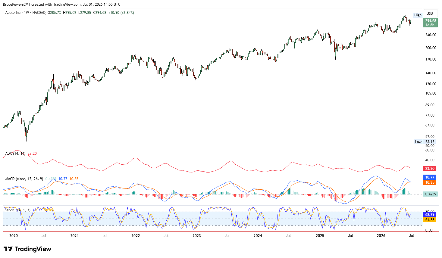
ADX, MACD, and Stochastics plotted beneath price, as shown in the Apple (AAPL) weekly chart above. Source: TradingView
The Three Components of MACD
The MACD has three main components. The MACD itself, blue in the chart above, indicates the difference between two moving averages of price. The signal line (orange) indicates a moving average of the MACD and can be used to get a handle on directionality. The histogram (green/red bars) indicates the difference between the MACD and the signal line and can be helpful in gauging relative momentum.
How to Use MACD Properly
I mentioned that the MACD can be used as both a trend-following indicator as well as a momentum-based one. It can be helpful to think of the MACD and the signal line as two separate moving averages of their own, with the MACD line being a faster MA and the signal line the slower one. Like with traditional MA crossovers, when the faster (MACD) line crosses above the signal line, this may indicate strengthening uptrend potential. The opposite is true for bearish crossovers.
The histogram indicates the difference between the two, with longer bars indicating greater distance between the MACD line and the signal line. As the bars shorten, this may indicate that the two lines are converging for a potential crossover.
MACD Signal Line Crossovers
A common approach to the MACD indicator is to look for crossovers of the MACD line with the signal line. When the MACD line crosses above the signal line, this suggests that bullish momentum is strengthening. When it crosses below the signal line, it shows momentum is waning or that bearish momentum may be increasing.
These crossovers are most useful when they agree with the larger trend in the market. For instance, Boyd Gaming (BYD) printed a wide-range reversal bar in April 2025 that took out highs from the last 10 sessions:
The stock had a bullish MACD signal at this point, adding confirmation to the bullish reversal bar:
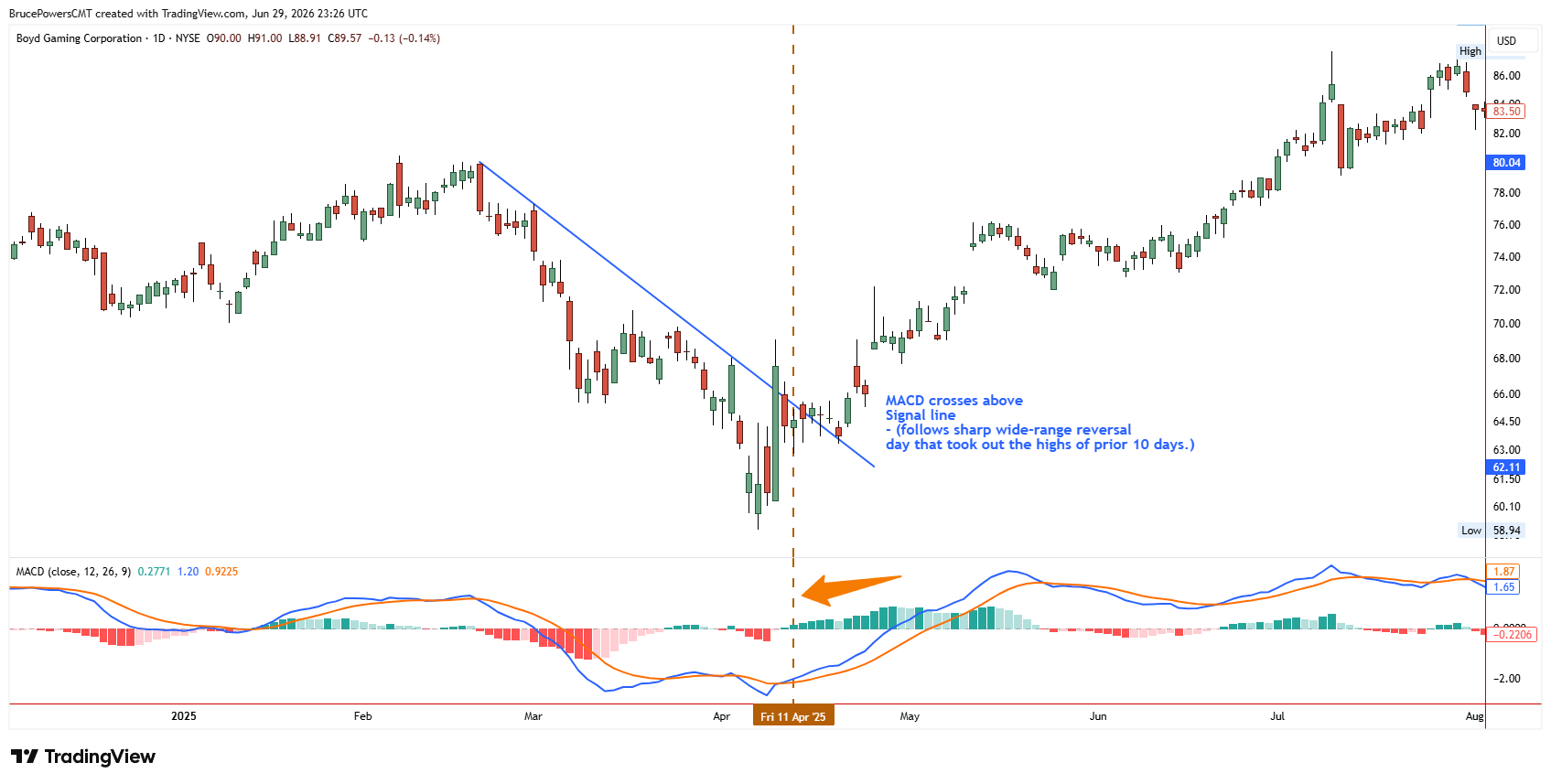
MACD line crosses above the signal line after a bullish reversal day shows improving demand, as shown in the Boyd Gaming (BYD) daily chart above. Source: TradingView
Above, I highlighted an instance where the MACD crossed above the signal line, potentially indicating strengthening upward momentum. It’s worth noting that this instance didn’t coincided with the histogram’s biggest green bar, however. That’s because momentum may be shifting before price action. In the first highlighted area above, we see that price action consolidated before resuming higher after the crossover.
Reading the MACD Histogram
MACD also comes with a histogram, which shows the difference between the MACD and the signal lines. When the MACD line is above the signal line, the histogram is positive. When the signal line is above the MACD line, the histogram is negative.
Traders watch the histogram to determine whether momentum is strengthening or weakening. Expanding histogram bars show increasing momentum; contracting histogram bars show weakening momentum. This can be an early warning that an advance or decline is running out of gas, even if it continues to move in that direction for a while.
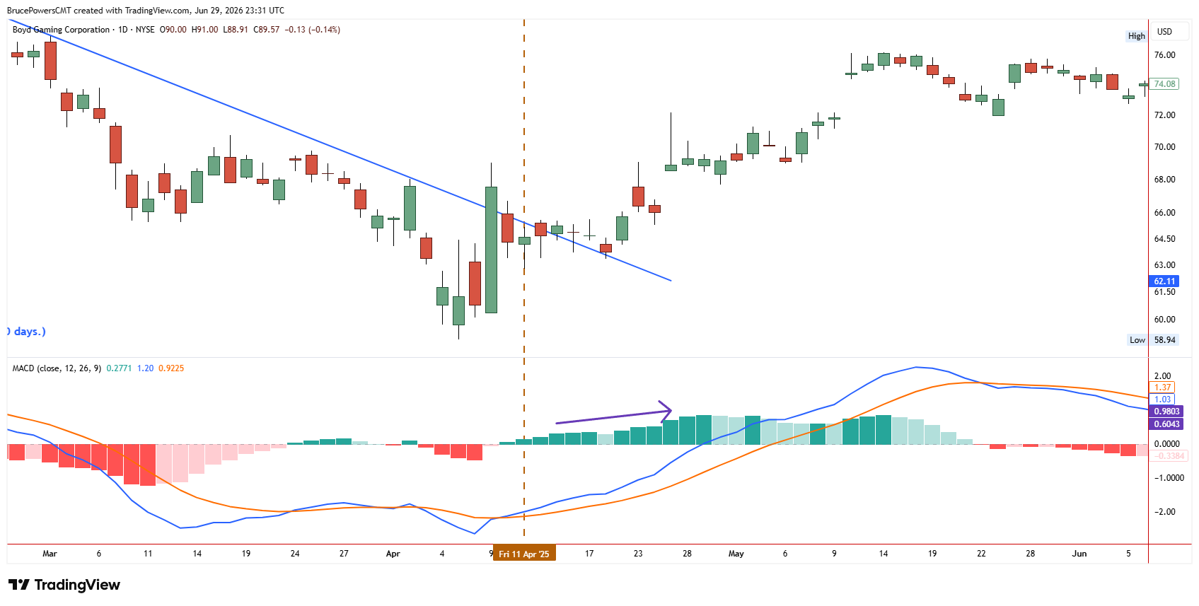
MACD histogram bars expand as bullish momentum accelerates, as shown in the Boyd Gaming (BYD) daily chart above. Source: TradingView
When MACD Works Best
MACD works best when a stock is in a solid uptrend or downtrend. It’s a momentum indicator, and trends typically involve waves of momentum. Choppy, sideways markets aren’t helpful, and can lead to a lot of false signals.
It’s best to use the MACD as a confirming indicator, to make sure momentum agrees with your bias, rather than a standalone indicator for trade signals.
What to watch for with ADX
ADX indicates the strength of a trend irrespective of direction. It doesn’t, however, indicate the phase of a trend. For instance, a stock that is making higher lows may have a weakening ADX reading if the advance is decelerating. Conversely, a stock could be losing steam, but continue higher as ADX picks up if it makes a sharp advance before reversing. This is why it’s helpful to use ADX within a larger context. It’s important to identify phases of trends, potential support/resistance areas, etc. ADX can be helpful to tell if a stock is consolidating, trending, or potentially reversing.
What to watch for with Stochastics
Stochastics indicate whether or not stocks are relatively overbought/oversold within a given range. This can be helpful in determining if stocks are stretched from recent averages, especially when they reach extremes. It’s important to consider what’s happening with the larger trend when interpreting Stochastics. Stocks in strong uptrends can remain in overbought territory for extended periods, for instance. Conversely, Stochastics can hover in the oversold region during bearish trends. Using them appropriately requires some practice, but they can be helpful when interpreted in the proper context.
There are lots of technical indicators that can be helpful if used in the proper context. It’s worth experimenting with each of them until you develop a sense of what’s helpful, what’s not, and in what contexts they’re helpful. Let me know if you have questions, comments, etc.
How to Use the Stochastics Indicator
The Stochastics Indicator compares the closing price to the recent range of trading to determine who is in control of the stock, whether buyers or sellers. It is most useful as a confirmation tool, or combined with trend-following indicators like moving averages for additional confluence.
There are two versions of Stochastics, namely Slow Stochastics, which smooths out some of the choppy price action to reduce false signals, and the more reactive and noisy Fast Stochastics. Both come with two lines, referred to as the %K line and the %D line. The %K line is the faster, more reactive line, and the %D line is a smoothed-out %K line.
The Four Primary Stochastics Signals
The four primary ways traders use Stochastics include looking for:
- Overbought and Oversold signals
- Crossovers of the %K and %D lines
- Divergences from the underlying stock
- Bullish/bearish confirmation from the 50 centerline
Each of these can be used to improve your market timing when coupled with an overall trend-following bias, support/resistance levels, and/or confirmation from other technical indicators. Let’s take a quick look at each of these signals in turn.
1. Overbought and Oversold Readings
The most common way to use Stochastics is looking for overbought (readings above 80) and oversold (readings below 20) signals. Some traders automatically sell the stock when Stochastics gets overbought and buy the stock when it gets oversold. This can be problematic in strong trends, as stocks that are rising for months can stay overbought for months, and vice versa.
For example, Caterpillar (CAT) spent months in the overbought territory while its share price continued to make new highs:

Stochastics remains overbought for an extended period as price rises, as shown in the Caterpillar (CAT) daily chart above. Source: TradingView
Conversely, a stock in a long-term decline may remain pinned to the bottom of the oscillator. For instance, Oracle (ORCL) trended lower from late 2025 into early 2026, with Stochastics reaching overbought at key turning points during pullbacks:
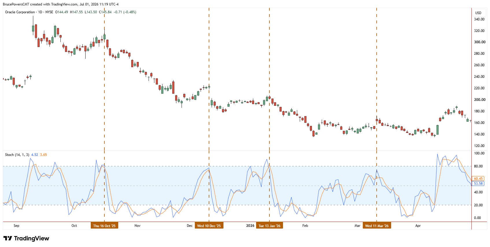
Stochastics reaches or nears overbought at key turning points during pullbacks in a downtrend, as shown in the Oracle (ORCL) daily chart above. Source: TradingView
So while these levels are worth watching, they’re best used in conjunction with other factors in technical analysis. Stochastics works best when the stock is trading in a range, repeatedly hitting support and resistance levels, like Colgate-Palmolive (CL) in the first half of 2025:
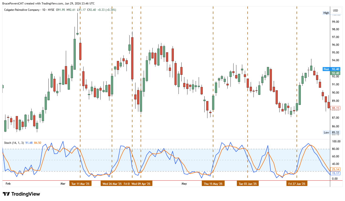
Crossovers from oversold and overbought conditions confirm momentum shifts in a range-bound market, as shown in the Colgate-Palmolive (CL) daily chart above. Source: TradingView
They can also be used to determine when a trend is likely to resume after a brief pullback, like the overbought signal in ORCL above.
3. Divergences
Stochastics can be used to identify potential reversals in a downtrend or uptrend when they print a bullish or bearish divergence from the stock’s price action. A bullish divergence is when Stochastics makes a higher low after the stock prints a lower low. A bearish divergence is the opposite, with Stochastics making a lower high while the stock makes a higher high.
4. Centerline (50) Confirmation
Stochastics also features a centerline that separates bullish from bearish momentum. Some traders wait for Stochastics to cross above this line to confirm that buyers are in control before buying stocks. Others look for stocks in an uptrend to pullback, get oversold, and then cross back above the centerline to confirm that the advance is ready to resume.
None of these signals should be used as a standalone indicator. The best results come from using Stochastics in addition to a larger picture of what’s happening with the stock, including its larger trends, key technical levels, and confluence from other indicators.
ADX is an oscillator that shows trend strength, not market direction. A rising or falling stock with a low ADX is a weak trend. A falling stock with a high ADX is a strong trend.
How to Use ADX to Measure Trend Strength
ADX is one of the lines that makes up the Directional Movement Index (DMI) oscillator. This indicator combines ADX’s trend strength with the direction of the trend—whether it is an uptrend or downtrend shown by two other lines in DMI: +DI (positive directional indicator) and -DI (negative directional indicator).
Positive Directional Indicator (+DI)
In DMI, the +DI line rising above the -DI line is a signal that an uptrend is in effect.
Negative Directional Indicator (-DI)
The -DI line rising above the +DI line is a signal that a downtrend is in effect.
How to Interpret ADX Readings
The ADX line in DMI indicates how strong a trend is. Low readings indicate no trend, or a weak or ranging market; a rising ADX indicates an uptrend or downtrend is forming; high readings indicate a strong uptrend or downtrend is in place. A falling ADX does not necessarily indicate a reversal, only that the current trend is losing strength, potentially moving into a new ranging market.
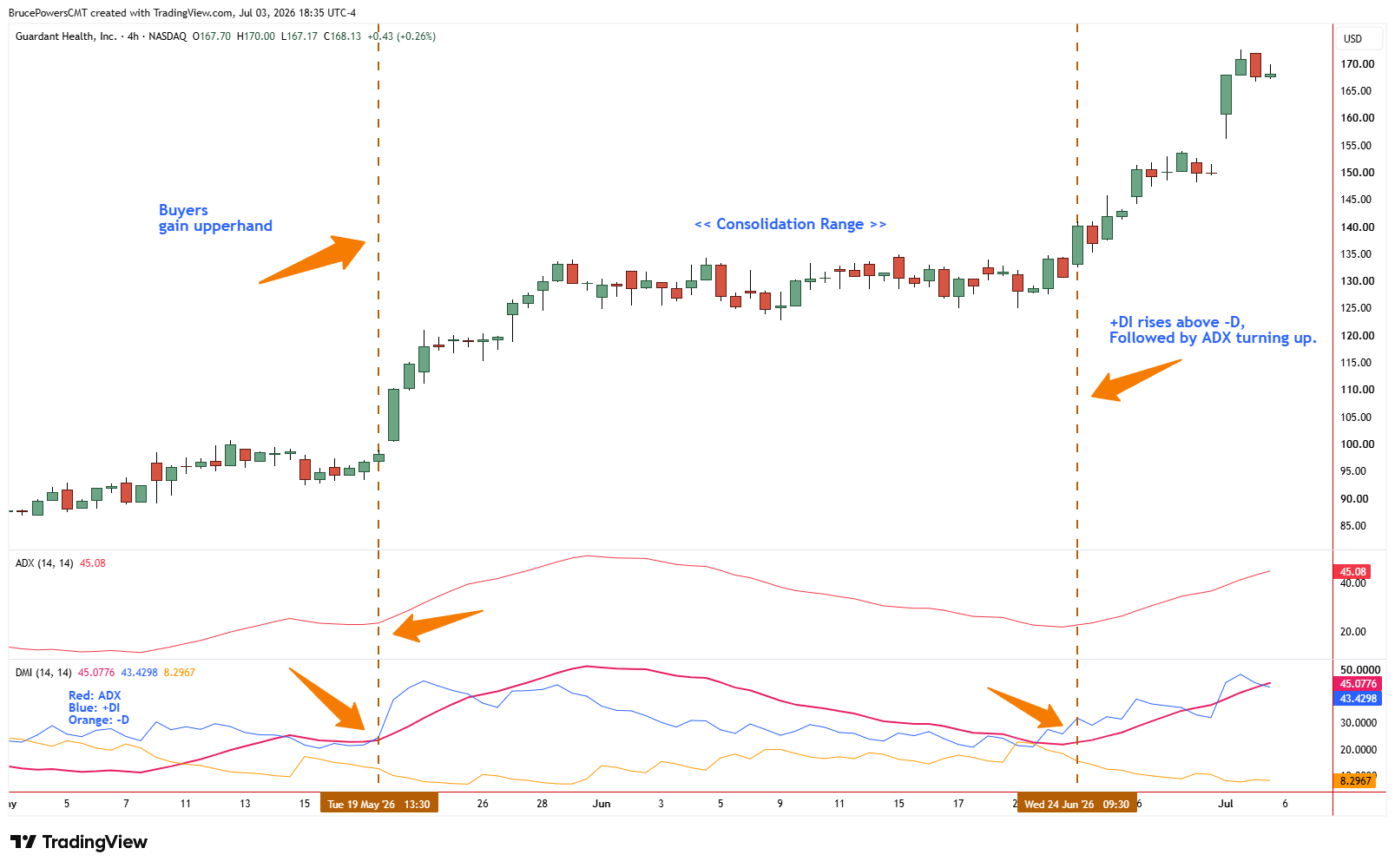
+DI rises above -DI and ADX turns up to confirm strengthening uptrends, as shown in the Guardant Health (GH) 4-hour chart above. Source: TradingView.
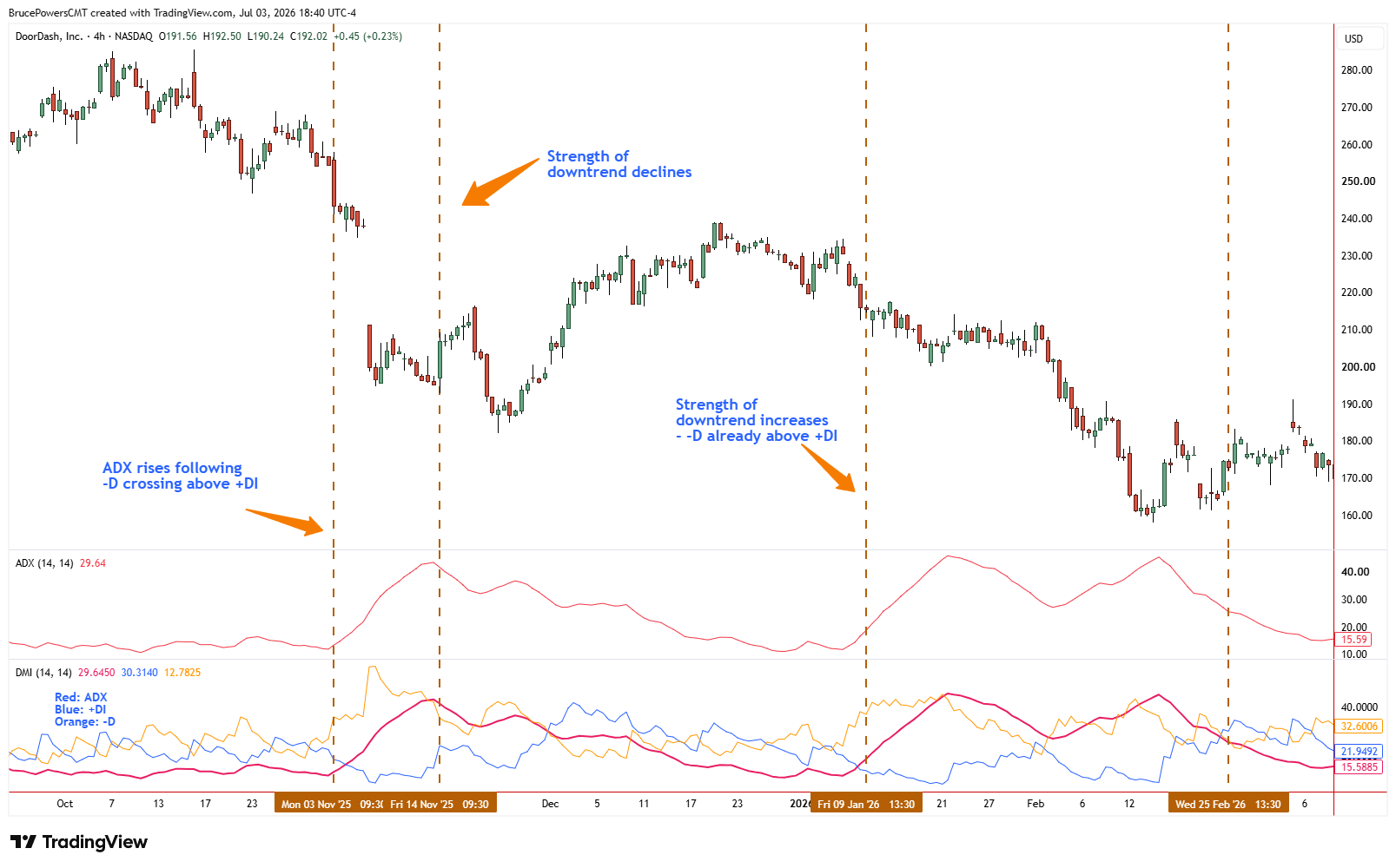
ADX rises as -DI takes control and the downtrend strengthens, as shown in the DoorDash (DASH) 4-hour chart above. Source: TradingView. Click to enlarge for free.
How to Use ADX
ADX shows the strength of a trend. Traders use this oscillator to help them determine the best trading strategy for current market conditions, for example, whether it is trending, which favors trend-following strategies, or range-bound .
Using ADX to Choose the Right Strategy
ADX helps a trader determine the most advantageous strategy for the market at hand. Oscillators can be used to confirm the health of a trend, to time entries and exits, and to gauge the strength of breakouts. ADX works well with other oscillators:
- MACD measures momentum in the same direction of a trend, confirming uptrend or downtrend strength
- Stochastics can be used to time entries and exits
Example 1: Hewlett Packard Enterprise Breakout Confirmation
ADX helps determine trend strength and market conditions to help traders choose strategies that perform well in trending or ranging markets. It can confirm the strength of a trend in a breakout. Hewlett Packard Enterprise (HPE) formed a base after years of trading in a range. April saw a burst of strength. The stock broke out of its base and the range. Stochastics came out of oversold first, followed by the MACD histogram moving up toward the zero line and then above it. As the uptrend strengthened, DMI’s ADX started to turn upward. Oscillators can be used to confirm the strength of trends. ADX measures the strength of the trend and works well with other oscillators that measure momentum (MACD) or time entries and exits (Stochastics).
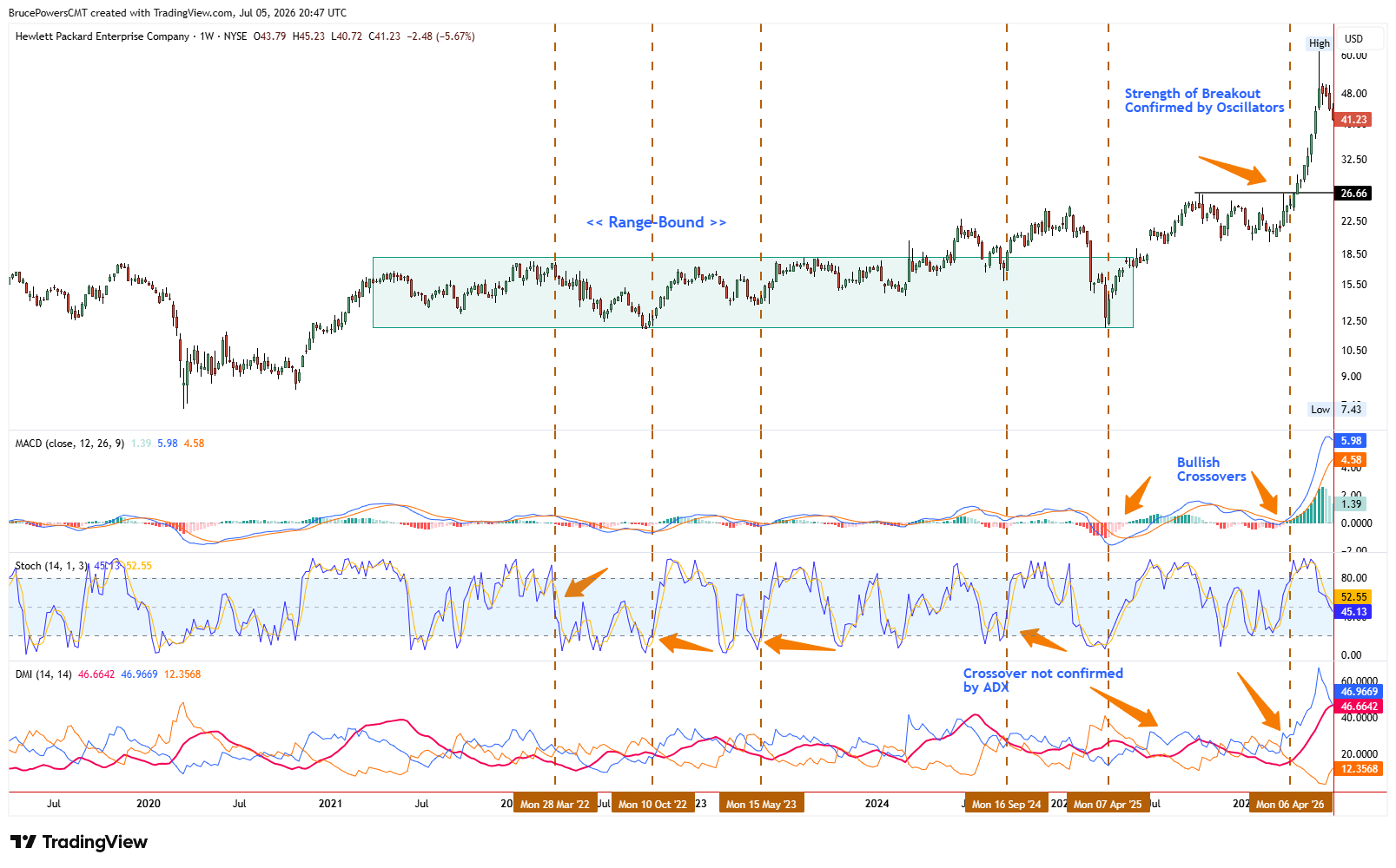
Oscillators confirm the strength of a breakout from a multi-year range, as shown in the Hewlett Packard Enterprise (HPE) weekly chart above. Source: TradingView. Click to enlarge for free.
Example 2: JFrog (FROG) Double Bottom Reversal
ADX measures trend strength regardless of direction and works well with other oscillators to confirm technical analysis, as shown in the JFrog Ltd. (FROG) example.
JFrog’s ADX and DMI lines show a healthy uptrend after a double-bottom pattern forms on the stock’s weekly chart. ADX starts to turn up after FROG reverses from the second bottom. This gives traders more confirmation that the reversal is valid. The weekly chart filters out some of the noise from lower timeframes.
The pattern gives traders an idea of a minimum target. Oscillators measure momentum and trend strength to time entries and measure the health of a trend. ADX shows a healthy uptrend with +DI above -DI, adding conviction to the reversal. The chart shows MACD, Stochastics, and DMI oscillators measuring different aspects of a potential reversal, providing confluence in favor of the trade. The chart shows MACD confirming uptrend momentum, Stochastics overbought readings warning of a correction, and ADX measuring uptrend strength to give traders different pieces of information on this move.
FROG first broke out of this double-bottom pattern above the neckline (horizontal trendline) drawn at the highs at $27.96. It reversed over the next seven trading days (red line) marked by lower highs and lower lows. It found support in the blue trendline around its 61.8% Fibonacci retracement level. Its breakout above the neckline for a second time confirms the pattern, giving traders a minimum target equal to the height of the pattern.
This is where traders might implement a buy stop order. At this point, the stock is starting to become overbought on the Stochastics oscillator and MACD confirms uptrend strength with its line above the signal line and its histogram above the zero line. ADX shows uptrend strength. ADX starts to rise as the uptrend strengthens, confirming the double-bottom breakout along with MACD and +DI rising above -DI. ADX provides another form of confirmation.
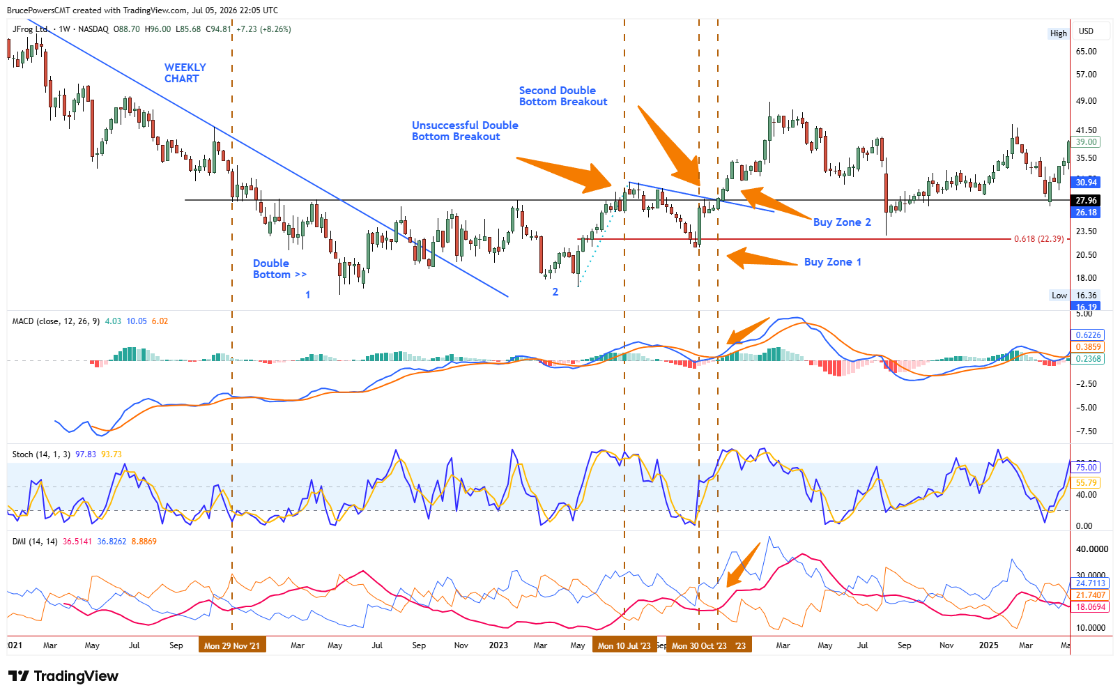
MACD, Stochastics, and DMI confirm a double bottom reversal at different stages, as shown in the JFrog (FROG) weekly chart above. Source: TradingView. Click to enlarge for free.
The Bottom Line
Oscillators like MACD, Stochastics, and ADX are most effective when used as supporting tools rather than standalone signals. Each adds a different layer of insight – momentum alignment, short-term timing, and trend strength. But the real value comes from how they work alongside price structure and broader market context. When used this way, they help traders better understand not just where the market is moving, but the quality and strength behind that movement.